
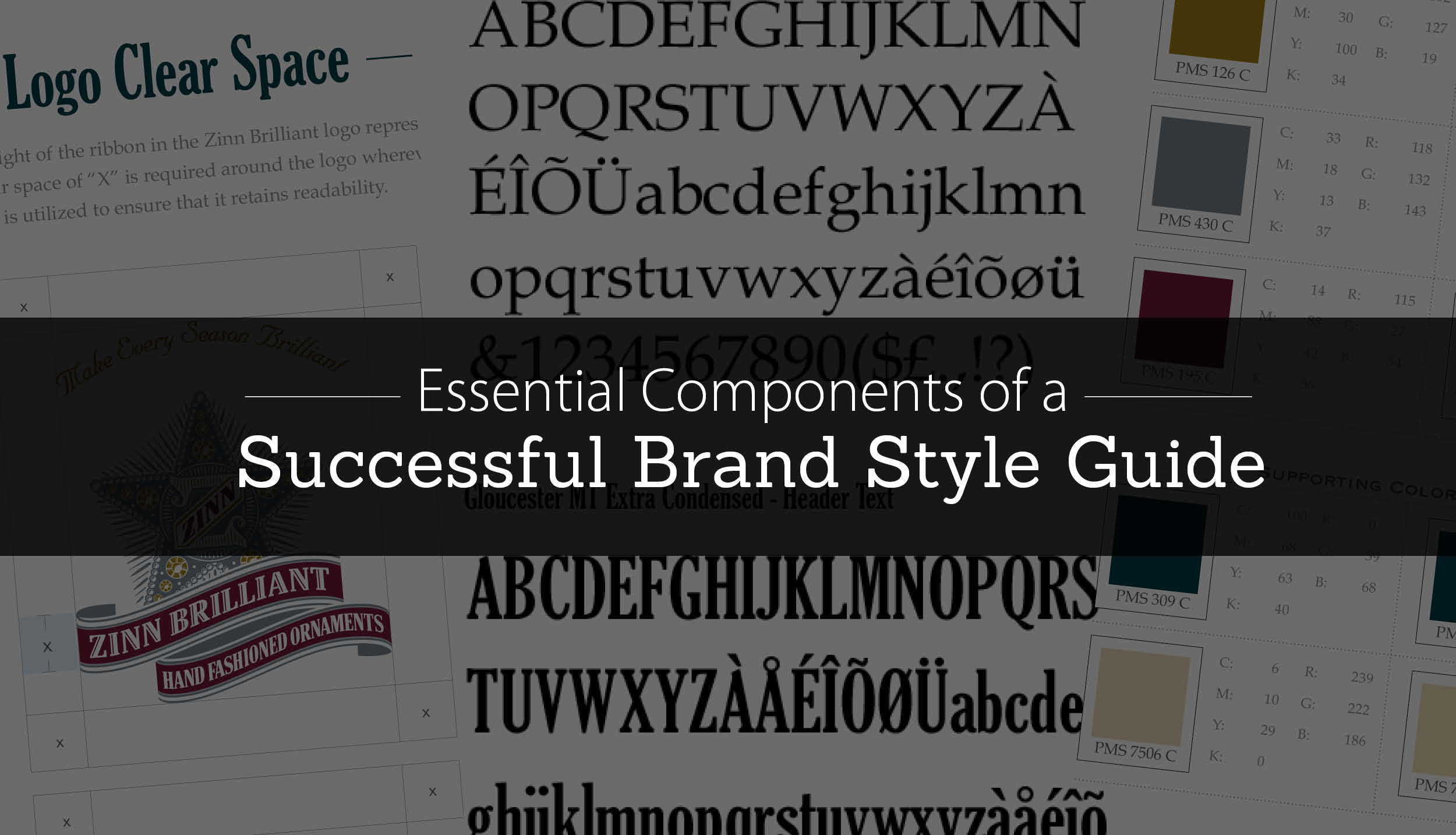
A few weeks ago, in our post on maximizing the benefits of your branding efforts, we touched on the importance of creating a set of guidelines after a brand has been established. To maintain consistency of brand and strengthen customer recognition, it’s important that all the decisions that your company and your branding team spent weeks deliberating—colors, typography, logo—be “set in stone” in a brand style guide, accessible anyone who may be responsible for creating or updating any brand-related content.
What should those guidelines contain? Here’s our list of the most important components of any brand style guide.
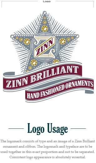
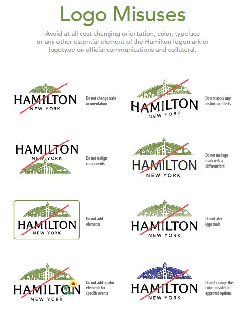
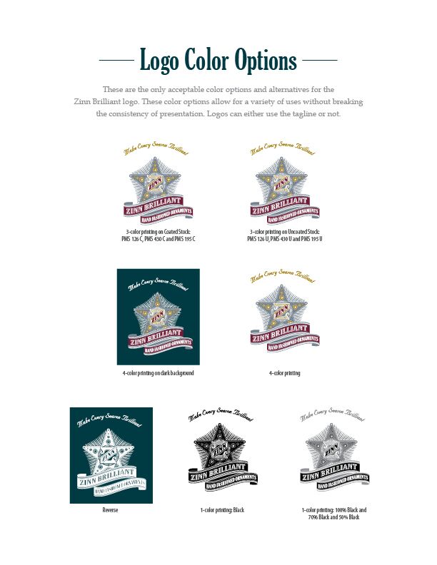
LOGO AND LOGO USAGE
This section of the guide should spell out very clearly how the logo should be utilized, any alternate versions, and how those versions should be used. It should provide examples for the user of which versions of the logo are used in full-color printing, which in black-and-white, which on the web, which in first usage (like on the front page of a booklet), and which ones thereafter. This can include any small icon versions of the logo, such as those used for social media accounts. It should also specify any placement restrictions for the logo—for example, if a logo needs 20 pixels of “free” or “clear” space, should always be bled off the page, needs to be placed on a specific background color, etc. Many guides also provide “don’ts”—examples of incorrect uses of the logo.
COLOR PALETTE
This section of the guide should spell out very clearly how the logo should be utilized, any alternate versions, and how those versions should be used. It should provide examples for the user of which versions of the logo are used in full-color printing, which in black-and-white, which on the web, which in first usage (like on the front page of a booklet), and which ones thereafter. This can include any small icon versions of the logo, such as those used for social media accounts. It should also specify any placement restrictions for the logo—for example, if a logo needs 20 pixels of “free” or “clear” space, should always be bled off the page, needs to be placed on a specific background color, etc. Many guides also provide “don’ts”—examples of incorrect uses of the logo.

TYPOGRAPHY
Your branding team, and your designer, chose your typeface (the style of text or font family) and your font (the text weight and size) for a reason: to communicate a certain feel or personality about your brand. The typefaces were also chosen because they interacted well together—whether it’s a serif and sans serif, a slab and a script, or any other combination. That’s why it’s important to keep the typefaces consistent. Your brand style guide should include all typefaces and fonts used and notes on how they’re used. It’s also helpful to indicate where the typeface can be accessed or purchased, in case another design team does work on the project down the line.


TAGLINE USAGE
Your tagline, also known as a “slogan,” is an integral part of the way your company presents itself to the public. Your brand style guide should include all acceptable uses of your tagline, including capitalization, punctuation, color, and placement specifications.
STYLE GUIDE FOR WRITTEN CONTENT
There are two parts of a written content style guide. The first is a guide to the more technical aspects of written content, much like a copyeditor or a publishing house might develop. This includes things like capitalization, abbreviations, punctuations, and unusual or brand-specific spellings.
The second part is a bit more subjective—the “tone” of your brand’s written content. We discussed about this in our post on maximizing the benefits of your branding efforts, but it’s very helpful for these things to be written out in a clear way, especially as written content may be contributed by anyone from a professional copywriter to the company’s CEO to an intern on social media. Your style guide should include some description of the type of voice that’s appropriate to your brand (for example, light and fun vs. formal and elegant), plus a brief list of “don’ts,” like “no swearing” or “no technical jargon.”
OTHER VISUAL COMPONENTS
You’ll also want to include a guide to using any related visuals, such as shapes, graphic elements, illustrations, and photographs, to ensure that all future designs effectively communicate the core values of your brand. This ensures that the brand you’ve established will be maintained throughout any future campaigns for years to come.